
After professor of art Bryan Springer designed a new font in the summer of 2017, he compared the process to climbing Mount Everest — but said that he would do it again.
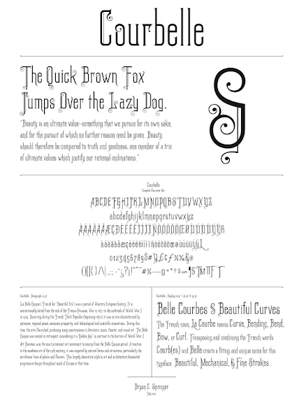
Called Courbelle (French for “beautiful curve), Springer envisioned the font while spending summer in New York City at the School of Visual Arts studying typography. Several instructors taught this four week residency, including the senior manager of Adobe Type Daniel Rhatigan, whom Springer called “amazing” and “inspirational.”
Along with the rest of the class, Springer first focused on drawing letters by hand and then drawing them digitally. They finally transitioned into typography. On their last day of the program, students presented their newly-designed fonts.
Springer found his inspiration from the Belle Époque, a period of naturalism related to during the Art Nouveau movements at the turn of the last century in Paris and Barcelona. This movement spread throughout Europe and America, inspiring long lines with flowing curves in interior design and architecture, much like the lines of Springer’s font.
“I was really inspired by script typefaces or calligraphic letter forms. As a part of this course we studied handwriting in practice and applied it to our designs for digital typeface,” he said. “I looked at time periods that were known for really decorative and lush letter forms.”
Courbelle is designed for decoration and display, Springer said. Its form isn’t necessarily conducive to long paragraph forms, but can be used for the names of products, designs on signs and headings.
The name “Courbelle” comes from the French noun, “la courbe” which translates to “curve,” and “belle” which means “beautiful.” Putting the two together, the Springer created the name “Courbelle” to mean “beautiful curve.”
Springer said he participated in the residency not only because of his personal interest in typography, but also so he could expand the college’s graphic design minor.
“We launched an introduction to typography class in spring of 2018 and I think it went very well,” Springer said. “I would like to modify some things to make it more effective and efficient, of course, but I think that’s what most professors do to keep it fresh.”
Senior Ethan Greb participated in Springer’s inaugural typography class in the spring of 2018, as well as his Graphic Design and Color Theory classes.
“As a professor, Springer engages his students in a very unique way,” Greb said. “ He knows more about Adobe products more than anyone else I know and is extremely helpful in the way he teaches design elements. Professor Springer fits right in the art department through the unique look at art he provides and the way he relates to students.”
Greb said he thinks the font lends itself to a very unique and niche for use, and has a very nice, sleek design.
Senior Anne Buzzell has had Springer for several classes, including typography. She called his new font “an interesting combination of mostly straight lines with script-like details on the letters’ serifs.”
Springer said the increased popularity of typography could be a result of digital alienation, and people’s desire to see beauty and creativity in their products.
“I think typography is popular right now because it’s a reaction to the static coldness of the computer. People are trying to express more real beauty in letter forms that we might find in letter press or hand-written calligraphy,” he said. “I think trying to bring that level of realism and beauty to the computer is an important thing to make it different and attractive and more real.”
Springer said typography is a different kind of art: Not only is it aesthetically pleasing, but it is also a way of communication.
“It is very much a part of a visual designer’s language. You can’t express visual content effectively without typography,” he said. “Typography introduces communication whereas illustration and painting don’t as much. The form and function of typography are to delight and evoke a positive response, and to communicate effectively.”
Designing a font requires extreme attention to detail, focusing on each letter’s form and even the amount of space between each letter.
“For me the joy is in sketching the forms before I even get to the computer,” he said.